Colorblind Curse
Colorblind Curse is a short game that challenges you to experience gaming from the perspective of a colorblind person.
Explore a dangerous tomb full of traps and treasures. But beware, one treasure carries a curse that affects your color vision. How will you survive when you can't tell the difference between safe and deadly spaces?
How to Play
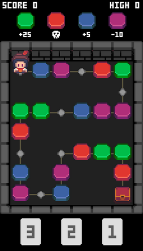
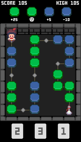
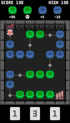
Colorblind Curse plays like a board game. Pick a card to move your character a number of spaces. Most spaces have an effect and are color coded. Consult the legend at the top of the screen to see what each color does.
Can you beat all 3 levels? Try to get the highest score possible.
Level 1 - You have regular vision. Each space is clearly labeled.
Level 2 - You are colorblind. Some colors look the same.
Level 3 - You're still colorblind but now each space also has an icon.
What is Colorblindness?
Colorblindness is a word we use to describe when someone has trouble seeing colors the way most people do.
Our eyes have special cells we call cones that help us see colors. Some of the cones detect red light, others blue light, and still others green light. They work together to give us all the colors we can see. We say a person is colorblind when at least one type of cone is broken — or is missing entirely.
Regardless of which form of colorblindness a person has, the effect is that the person can have trouble telling the difference between certain colors.
I have a type of colorblindness called protanomaly, which means the red cones in my eyes are broken. I see colors like everyone else, but with less red in them. For example, some pinks look gray to me, because pink is red mixed with white. Some purples look blue to me, because purple is red mixed with blue. I also have trouble telling apart some shades of red, green, orange, brown, or yellow.
Accommodating Colorblindness
Colorblindness can make it difficult to use apps, follow instructions, or play games that rely on colors. However, you can make your designs more accessible by following some simple guidelines.
- DO use color-coding. Although colorblind people can't take full advantage of color labels, don't remove them from your designs. Color is a great way to visually organize items.
- DO add another visual label besides color whenever possible. It can be text or symbols or icons. This way, you can make your designs work for everyone without needing a separate colorblind mode.
- DON'T try to find a perfect combination of colors that will work for everyone. There are too many types of colorblindness for this approach to be effective.
Credits
Programming: Joe DeStazio
Art: Franuka and IDLandGames
Fonts: VEXED
Sound effects: GamemasterAudio
Music: PaulKA and Pixabay
Special thanks to Abe Austin and Josh Pollard for their playtesting and valuable feedback.
| Status | Released |
| Platforms | HTML5 |
| Rating | Rated 4.7 out of 5 stars (3 total ratings) |
| Author | Joe DeStazio |
| Genre | Educational |
| Made with | Aseprite, Phaser |
| Tags | Board Game, colorblind, Pixel Art |
| Code license | MIT License |
| Average session | A few minutes |
| Languages | English |
| Inputs | Mouse, Touchscreen, Smartphone |


Comments
Log in with itch.io to leave a comment.
This is such an awesome way to teach the importance of accessibility in games! I’m not colorblind, but realising that level 2 was basically a guessing game for colorblind folks really made me think.